CSS Anchor Positioning + Popover API: JS-Free Dropdowns — ContentBuffer guide

CSS Anchor Positioning + Popover API: JS-Free Dropdowns

K
Kodetra Technologies··9 min read Intermediate

Summary

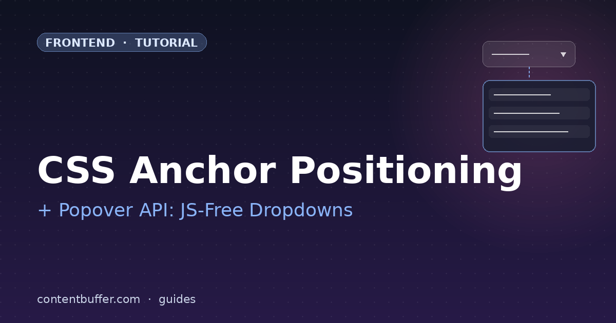
Build dropdowns, tooltips, and menus natively in 2026 — no JavaScript, no Floating UI.

For a decade, building a tooltip, dropdown menu, or popover meant reaching for Floating UI, Popper.js, or hand-rolled getBoundingClientRect() math wired to scroll listeners. Every team rebuilt the same mess: a click handler, a positioning loop, an outside-click handler, an Escape-key handler, focus management. None of that was the actual feature. It was the price of admission.

As of May 2026, that price has dropped to roughly zero. The Popover API shipped in all evergreen browsers, and CSS Anchor Positioning followed: Chrome and Edge since 125, Firefox since 132, Safari since 18.2 (with full @position-try in 18.4). Together they replace 90% of what you used JavaScript for, declaratively, in CSS.

This guide walks through the two APIs from scratch, builds three production-grade components — a dropdown menu, a tooltip, and a context menu — and finishes with the gotchas that will bite you in real apps: flipping when there is no room, accessibility, and the fallback strategy for browsers older than 18 months.

Why now, beyond browser support? Three reasons. First, the headless component shift (Radix, Headless UI, Ark) trained the industry on accessible primitives, but those libraries still depend on Floating UI underneath, which means you ship a positioning runtime to every visitor. Replacing it with platform CSS removes a whole load-time tax. Second, server components and partial hydration architectures get cheaper when popovers do not need a hydration boundary just to position themselves. Third, designers can finally express positioning intent in CSS again — the place it always belonged.

Prerequisites

  • Comfortable with modern CSS (custom properties, logical properties).
  • Working understanding of HTML semantics and ARIA basics.
  • A browser from the last 12 months. Chrome 125+, Edge 125+, Firefox 132+, or Safari 18.2+.
  • No frameworks required. Everything below works in a single static .html file.

Part 1: The Popover API in 90 seconds

Before anchor positioning makes sense, you need to know what it is anchoring. The Popover API is a single HTML attribute, popover, that turns any element into a top-layer element with built-in light-dismiss, Escape-to-close, and focus management.

Three pieces:

  • popover — attribute on the element that pops. Values: auto (light-dismiss, default) or manual.
  • popovertarget — attribute on the invoker (a <button>) pointing to the popover's id.
  • popovertargetaction — optional, one of show, hide, toggle. Defaults to toggle.

Minimum viable popover:

<button popovertarget="my-tip">Help</button>
<div id="my-tip" popover>
  This appears in the top layer. Click outside or press Escape to dismiss.
</div>

That is the entire baseline. No JavaScript. The browser puts the <div> into the top layer (above everything, no z-index stacking issues), traps focus on open, restores focus on close, dismisses when you click outside or press Escape, and even stacks correctly when you nest popovers. The only thing it does not do out of the box is position the popover next to the button. That is what anchor positioning is for.

Part 2: Anchor positioning fundamentals

CSS Anchor Positioning has four moving parts. Learn these and the rest is recipes.

  • anchor-name — declared on the anchor element. Starts with two dashes: anchor-name: --my-button;
  • position-anchor — declared on the positioned element. Tells it which anchor to bind to.
  • anchor() — a function used inside top, left, inset, etc. Reads the anchor's edges.
  • position-area — a shorthand that places the element in a 3×3 grid relative to the anchor. The 99% case.

The two ways to position. Both are valid; pick by readability.

Approach A — anchor() function

.anchor   { anchor-name: --btn; }
.tooltip  {
  position: absolute;
  position-anchor: --btn;
  top:  anchor(bottom);   /* tooltip top = button bottom */
  left: anchor(left);     /* tooltip left aligns with button left */
  margin-top: 0.5rem;
}

Approach B — position-area shorthand

.anchor   { anchor-name: --btn; }
.tooltip  {
  position: absolute;
  position-anchor: --btn;
  position-area: bottom span-right;  /* below, anchored to left edge */
  margin-top: 0.5rem;
}

position-area uses physical or logical region keywords: top, bottom, start, end, center, plus span-* modifiers. It reads like English: bottom span-right means "under the anchor, sized from its left edge outward." Use this style when you can — it is the readable default.

Part 3: The magic combo — implicit anchors

Here is the detail nearly every tutorial buries. When a button uses popovertarget to open a popover, the browser automatically establishes an implicit anchor reference between them. You do not need to declare anchor-name or position-anchor at all.

<button popovertarget="menu">Account ▾</button>
<div id="menu" popover>
  <button>Profile</button>
  <button>Billing</button>
  <button>Sign out</button>
</div>

<style>
#menu {
  position-area: bottom span-right;
  margin: 0;
  margin-top: 0.5rem;
}
</style>

That is a complete, accessible dropdown. Click the button, the menu opens below it. Click outside, it closes. Press Escape, it closes. Tab, focus moves through the items. Total JavaScript: zero.

Part 4: A real dropdown menu, end to end

Time to ship something polished. The example below is what you would actually paste into a production component library, complete with arrow indicator, transitions, and dark mode.

<button class="trigger" popovertarget="user-menu" aria-haspopup="menu">
  Tasha Lee <span aria-hidden="true">▾</span>
</button>

<div id="user-menu" popover role="menu" class="menu">
  <button role="menuitem">Profile</button>
  <button role="menuitem">Settings</button>
  <hr role="separator">
  <button role="menuitem">Sign out</button>
</div>
.menu {
  /* Anchor + position */
  position-area: bottom span-left;
  margin: 0; padding: 0.25rem;
  margin-top: 0.5rem;

  /* Visuals */
  min-width: 12rem;
  background: Canvas;
  color: CanvasText;
  border: 1px solid color-mix(in srgb, CanvasText 15%, transparent);
  border-radius: 0.5rem;
  box-shadow: 0 12px 28px -8px rgb(0 0 0 / 0.18);

  /* Entry animation */
  opacity: 0;
  translate: 0 -4px;
  transition: opacity 120ms, translate 120ms, display 120ms allow-discrete;
}
.menu:popover-open {
  opacity: 1;
  translate: 0 0;
}
@starting-style {
  .menu:popover-open { opacity: 0; translate: 0 -4px; }
}

.menu [role="menuitem"] {
  display: block; width: 100%;
  padding: 0.5rem 0.75rem;
  border: 0; background: transparent;
  text-align: start; border-radius: 0.375rem;
}
.menu [role="menuitem"]:hover,
.menu [role="menuitem"]:focus-visible {
  background: color-mix(in srgb, CanvasText 8%, transparent);
}

Three things in that CSS earn special notice. :popover-open is the pseudo-class that matches while the popover is showing — use it to drive entry/exit transitions. @starting-style defines the before-shown state so you can animate from invisible to visible without a JavaScript class toggle. And transition: ... display ... allow-discrete is the new piece of magic that lets non-animatable properties (like display) participate in transitions, which is what makes the close animation work without unmounting hacks.

Part 5: Handling overflow with @position-try

What happens when the user opens that menu near the right edge of the viewport? By default it would clip. The fix is @position-try, which defines fallback positions the browser tries in order if the primary placement does not fit.

@position-try --flip-up {
  position-area: top span-left;
  margin-top: 0;
  margin-bottom: 0.5rem;
}
@position-try --flip-right {
  position-area: bottom span-right;
}

.menu {
  position-area: bottom span-left;
  margin-top: 0.5rem;
  position-try-fallbacks: --flip-up, --flip-right, flip-block, flip-inline;
}

The browser walks the fallback list in order. If bottom span-left does not fit, it tries --flip-up. If that fails, --flip-right, then the built-ins flip-block and flip-inline. The first one that fits wins. This is the entire flipping algorithm that took Floating UI thousands of lines of JavaScript, expressed in five lines of CSS.

Part 6: Tooltip — a different shape of the same idea

Tooltips are popovers that open on hover or focus rather than click. The Popover API has a popover=hint mode (Chrome 134+, behind a flag elsewhere as of May 2026) that handles this, but the broadly compatible recipe is to use popover=manual plus a tiny bit of JavaScript — the only place we will write any in this guide.

<button class="info" aria-describedby="tip-1"
        onmouseover="tip1.showPopover()" onmouseout="tip1.hidePopover()"
        onfocus="tip1.showPopover()"     onblur="tip1.hidePopover()">
  ?
</button>
<div id="tip-1" popover="manual" role="tooltip" class="tooltip">
  Your password must be at least 12 characters.
</div>

<style>
.info  { anchor-name: --info-1; }
.tooltip {
  position-anchor: --info-1;
  position-area: top;
  margin: 0; margin-bottom: 0.5rem;
  padding: 0.4rem 0.6rem;
  background: #1f2937; color: white;
  border-radius: 0.375rem; font-size: 0.875rem;
  position-try-fallbacks: flip-block;
}
</style>

Here we declared anchor-name explicitly because the tooltip is not opened via popovertarget (we are using the manual mode), so there is no implicit anchor. aria-describedby on the button gives screen readers the relationship the visual positioning implies. Without it, this would be inaccessible.

Part 7: Context menu — anchor to the cursor

Context menus need to appear at the cursor, not at a fixed element. Anchor positioning still helps — we just move the anchor element to the cursor on right-click. Here the anchor is a 1px invisible <div> we reposition with two lines of JavaScript.

<div id="cursor-anchor" style="position:fixed; width:1px; height:1px;"></div>
<div id="ctx" popover role="menu" class="menu">
  <button role="menuitem">Cut</button>
  <button role="menuitem">Copy</button>
  <button role="menuitem">Paste</button>
</div>

<script>
  const anchor = document.getElementById("cursor-anchor");
  anchor.style.anchorName = "--cursor";
  document.addEventListener("contextmenu", (e) => {
    e.preventDefault();
    anchor.style.left = e.clientX + "px";
    anchor.style.top  = e.clientY + "px";
    document.getElementById("ctx").showPopover();
  });
</script>

<style>
  #ctx { position-anchor: --cursor; position-area: bottom span-right;
         position-try-fallbacks: flip-block, flip-inline; }
</style>

All the hard parts — flipping near edges, top-layer rendering, light dismiss, focus return — are still handled by the platform. Our code is the part that is actually unique to a context menu: the cursor coordinates.

Common pitfalls

  • Forgetting position: absolute or fixed. anchor() only works on absolutely-positioned elements. With popovers in the top layer you usually do not have to set this — the browser does — but if you wrap content in custom layouts you might.
  • Margins on popover elements default to auto. Browsers center popovers in the viewport by default. Always set margin: 0; before applying anchor positioning, or you will see a strange center-then-flip dance.
  • Anchor names are scoped to the element's containing block, not global like CSS variables. If your popover sits inside a different stacking context than the anchor, declare the anchor name on a parent with anchor-scope or use the implicit anchor via popovertarget.
  • The order of position-try-fallbacks matters. The browser stops at the first fit. Put your most-preferred alternative first.
  • Do not animate top/left with anchor(). Each frame the browser would have to recompute the anchor — expensive and janky. Animate opacity and translate instead, as we did above.
  • Accessibility is not free. The Popover API gives you focus management, but screen-reader semantics still need role="menu", role="menuitem", aria-haspopup, and aria-expanded where appropriate. Tooltips need aria-describedby on the trigger.

Fallback strategy for older browsers

Browser support for the full feature set is solid as of May 2026 but not universal. If you support browsers older than ~18 months you need a fallback. Two patterns work:

  1. Progressive enhancement. Use feature detection with @supports. The fallback can be a simple position: absolute with hard-coded coordinates that looks acceptable. The dropdown still works, it just does not flip.
  2. Polyfill. The @oddbird/popover-polyfill and @oddbird/css-anchor-positioning packages cover ~95% of features for older browsers. Ship them via <script type="module"> with a dynamic import gated on feature detection so modern users pay nothing.
@supports not (anchor-name: --x) {
  /* Fallback: render the menu with absolute positioning, no flipping */
  .menu { left: 0; top: 100%; }
}

Quick reference

FeatureWhat it doesWhere it goes
popoverMarks element as popover (top layer + dismiss)Element
popovertargetWires invoker to popover by idButton
:popover-openCSS pseudo-class while shownSelector
anchor-nameNames an element so others can anchor to itAnchor element
position-anchorBinds positioned element to a named anchorPositioned element
anchor()Reads anchor edges in top/left/etc.Property values
position-area9-region grid shorthand for placementPositioned element
@position-tryDefines a fallback placementStylesheet
position-try-fallbacksOrdered list of fallbacksPositioned element
@starting-stylePre-shown state for entry animationsStylesheet

Next steps

  • Replace the next custom dropdown in your codebase with the pattern from Part 4. Measure the bundle-size delta — most teams see 8–15 KB shed per replaced Floating UI usage.
  • Read the MDN guide on anchor positioning for advanced patterns: chained anchors, conditional sizing, and anchor-size().
  • Audit your existing tooltips and popovers for the accessibility hooks listed under common pitfalls.
  • If you ship to enterprise, add the @oddbird polyfill packages and feature-gate them.

The browser is finally doing the work. The ten-line dropdown in this post is the same component we used to import three libraries to build. Take the win.

One last note. Most of the win here is about removing complexity, not adding features. If you maintain a design system, the right move is to update your existing components in place rather than introducing new ones. Replace the positioning engine, keep the public API, and your consumers get the bundle-size and accessibility wins automatically the next time they ship.

Comments

Subscribe to join the conversation...

Be the first to comment