Jetpack Compose Grid API: Build 2D Android Layouts
Summary
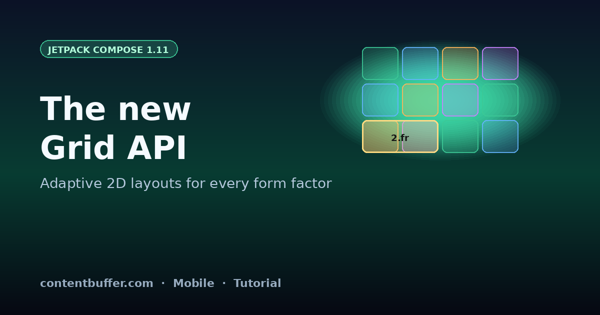
New Compose 1.11 Grid composable: tracks, gaps, Fr units, adaptive 2D layouts.
On April 8, 2026, Google shipped the stable Jetpack Compose April '26 release (Compose 1.11) with a long-requested addition: a first-class non-lazy Grid composable. Until now, anything beyond a Row or Column meant either nesting them with awkward weights, reaching for LazyVerticalGrid (which is built for scrolling, not screen layout), or pulling in a third-party library like gridpad-android.
This guide walks through the new Grid API end to end. By the time you finish, you will have a real adaptive product card screen that reflows from phone to foldable to tablet, using tracks, fractional units, gaps, and explicit spans. We will also cover the gotchas that tripped up early adopters during the 1.11 beta — measurement order, weight semantics versus Fr, and why the Grid is not a drop-in replacement for LazyVerticalGrid.
Prerequisites
- Android Studio Panda 4 (April 2026) or newer.
- Kotlin 2.1.20 or newer; AGP 8.9 or newer.
- An Android project that already uses Jetpack Compose. If you are starting fresh, run
File → New → New Project → Empty Activity (Compose). - Familiarity with composables, modifiers, and the
@Previewannotation.
Step 1 — Add Compose 1.11 to your project
Update the Compose BOM to the April '26 release. Inside your module-level build.gradle.kts:
dependencies {
    implementation(platform("androidx.compose:compose-bom:2026.04.01"))
    implementation("androidx.compose.foundation:foundation")
    implementation("androidx.compose.material3:material3")
    implementation("androidx.compose.ui:ui-tooling-preview")
    debugImplementation("androidx.compose.ui:ui-tooling")
}
The Grid composable lives in androidx.compose.foundation.layout, so no extra artifact is needed once you are on BOM 2026.04.01. Sync Gradle and you are ready.
Step 2 — Your first Grid: a 3×3 dashboard
Let's start with the smallest useful example: a fixed 3×3 dashboard of stat tiles. Three columns of 160.dp, three rows of 90.dp, and an 8.dp gap between every cell.
import androidx.compose.foundation.layout.Grid
import androidx.compose.foundation.layout.column
import androidx.compose.foundation.layout.row
import androidx.compose.foundation.layout.rowGap
import androidx.compose.foundation.layout.columnGap

@Composable
fun StatGrid() {
    Grid(
        config = {
            repeat(3) { column(160.dp) }
            repeat(3) { row(90.dp) }
            rowGap(8.dp)
            columnGap(8.dp)
        },
    ) {
        repeat(9) { i ->
            StatTile(label = "Metric ${i + 1}")
        }
    }
}
Children fill cells in row-major order by default — left to right, top to bottom — exactly like CSS Grid's auto-placement. With nine children and a 3×3 track grid, every cell gets exactly one tile. No Modifier.weight(), no nested rows, no math.
Step 3 — Tracks, gaps, and Fr units
Fixed dp tracks are fine for icons and tiles, but real screens need to flex. The Grid API supports four track sizing modes:
| Mode | Syntax | Use it for |
|---|---|---|
| Fixed | column(160.dp) | Icons, avatars, anything pixel-perfect. |
| Fractional | column(1.fr) | Fluid columns that share leftover space. |
| Percentage | column(40.percent) | Sidebars sized relative to the parent. |
| Intrinsic | column(IntrinsicSize.Max) | Tracks that hug their widest child. |
The most powerful of these is the new Fr unit. It works like CSS fr: after every fixed and intrinsic track has claimed its space, the remainder is divided among Fr tracks proportionally. So column(2.fr) next to column(1.fr) means the first track gets two-thirds of the leftover width.
Grid(
    config = {
        column(IntrinsicSize.Max) // sidebar — hugs its content
        column(2.fr)              // main — gets 2/3 of remaining width
        column(1.fr)              // aside — gets 1/3 of remaining width
        row(IntrinsicSize.Max)
        rowGap(16.dp)
        columnGap(16.dp)
    },
) {
    SidebarNav()
    ContentPane()
    DetailPane()
}
Step 4 — Real example: an adaptive product card screen
Here is a more realistic layout: a product detail screen with a hero image, a title block, a price/CTA card, and a specs panel. On a phone we want a single column; on a foldable we want hero + summary side-by-side; on a tablet we want a true 12-column layout with the specs panel pinned to the right.
The Grid API makes this almost embarrassingly clean. We compute the column configuration from a WindowSizeClass, then place children with explicit columnSpan and rowSpan via the new Modifier.grid() helper.
@Composable
fun ProductScreen(windowSize: WindowSizeClass) {
    val columns = when (windowSize.widthSizeClass) {
        WindowWidthSizeClass.Compact  -> 4
        WindowWidthSizeClass.Medium   -> 8
        WindowWidthSizeClass.Expanded -> 12
        else -> 4
    }

    Grid(
        config = {
            repeat(columns) { column(1.fr) }
            row(IntrinsicSize.Max) // hero
            row(IntrinsicSize.Max) // body
            rowGap(24.dp)
            columnGap(16.dp)
        },
    ) {
        // Hero image — always full width
        HeroImage(
            modifier = Modifier.grid(columnSpan = columns, rowSpan = 1)
        )

        // Title block — half width on medium+, full on compact
        TitleBlock(
            modifier = Modifier.grid(
                columnSpan = if (columns >= 8) columns / 2 else columns
            )
        )

        // Price + CTA — fills the other half on medium+
        PriceCard(
            modifier = Modifier.grid(
                columnSpan = if (columns >= 8) columns / 2 else columns
            )
        )

        // Specs panel — only pinned on expanded; otherwise full width below
        if (columns == 12) {
            SpecsPanel(modifier = Modifier.grid(columnSpan = 4, rowSpan = 2))
        } else {
            SpecsPanel(modifier = Modifier.grid(columnSpan = columns))
        }
    }
}
Two things to notice. First, columnSpan and rowSpan are declarative — there is no manual placement math, and Compose's auto-flow fills holes left to right, top to bottom. Second, switching layouts across breakpoints is just an if on the column count. The same composable tree handles every form factor, which is exactly what previous nested Row/Column setups could not do without painful branching.
Step 5 — Explicit placement with grid coordinates
Auto-flow covers most cases, but sometimes you need a child to land in a specific cell — for example, a 'New' badge in the top-right of a card. Modifier.grid() accepts columnStart and rowStart (1-indexed) for absolute placement:
Box(
    Modifier
        .grid(columnStart = columns, rowStart = 1, columnSpan = 1, rowSpan = 1)
        .background(Color.Red, RoundedCornerShape(50))
        .padding(horizontal = 8.dp, vertical = 2.dp)
) {
    Text("NEW", color = Color.White, style = MaterialTheme.typography.labelSmall)
}
Negative indices count from the end, so columnStart = -1 always lands in the rightmost column regardless of how many columns the breakpoint produced. This is the cleanest way to pin trailing content in an adaptive layout.
Step 6 — Reacting to posture and orientation
Grid is a regular composable, so all standard Compose state patterns apply. To react to a foldable's posture (book mode, tabletop, half-open), combine WindowSizeClass with the new WindowInfo.posture field shipped in the same April '26 release:
val posture = LocalWindowInfo.current.posture
val columns = when {
    posture is Posture.TableTop -> 6   // top half tilted, 6-col strip
    posture is Posture.Book     -> 8   // two-page book layout
    windowSize.widthSizeClass == WindowWidthSizeClass.Expanded -> 12
    windowSize.widthSizeClass == WindowWidthSizeClass.Medium   -> 8
    else -> 4
}
Step 7 — When to pick Grid vs LazyVerticalGrid
It is tempting to swap every LazyVerticalGrid for the new Grid, but they solve different problems. Grid is a non-lazy, structural container: it measures every child up front and pays for that with deterministic placement, intrinsic sizing, and full row/column span support. LazyVerticalGrid is a virtualized list that happens to render in two dimensions — it cannot do intrinsic sizing across rows, but it scales to thousands of items because it only composes what is on screen.
A simple rule of thumb: if your item count is fixed, known, and small (under roughly 200 cells), use Grid. If items come from a paged data source, a database query, or a network feed, stay with LazyVerticalGrid. The two compose well together — a top-level Grid for screen chrome with a LazyVerticalGrid embedded in one of its cells is a very common pattern in the new sample apps Google shipped alongside the 1.11 release.
Grid(
    config = {
        column(280.dp)   // pinned filter rail
        column(1.fr)     // scrollable product feed
        rowGap(0.dp)
        columnGap(16.dp)
    },
) {
    FilterRail()
    LazyVerticalGrid(                   // virtualized inside a Grid cell
        columns = GridCells.Adaptive(160.dp),
        contentPadding = PaddingValues(8.dp),
        verticalArrangement = Arrangement.spacedBy(8.dp),
        horizontalArrangement = Arrangement.spacedBy(8.dp),
    ) {
        items(products) { ProductCell(it) }
    }
}
Common pitfalls
Three issues catch most teams porting from nested Row/Column layouts:
- Do not use Grid for long lists. Grid measures every child eagerly. For scrollable feeds with hundreds of items,
LazyVerticalGridis still the right tool — it virtualizes off-screen items. Reach forGridonly when you have a bounded number of cells (think dashboards, forms, screen-level chrome). - Fr is not weight.
Modifier.weight()divides the parent's remaining space among siblings;1.frdivides the Grid's leftover track space amongFrtracks. They look similar but compose differently when intrinsic content forces a track to grow. - columnSpan must fit. If you ask for
columnSpan = 8on a 4-column grid, Compose 1.11 will throwIllegalArgumentExceptionin debug builds and clamp silently in release. Always derive spans from the live column count. - Auto-flow honors source order. Reorder children in code to reorder them visually. There is no
orderequivalent yet — track this on the Compose issue tracker if you need it.
Quick reference
| API | Where it lives | What it does |
|---|---|---|
Grid { ... } | foundation.layout | The 2D layout container. |
column(size) | config block | Adds a column track. |
row(size) | config block | Adds a row track. |
rowGap(dp) / columnGap(dp) | config block | Gutter between tracks. |
1.fr | Track size | Fractional unit, like CSS fr. |
40.percent | Track size | Percent of Grid's available size. |
IntrinsicSize.Max | Track size | Hug the widest/tallest child. |
Modifier.grid(...) | Child modifier | Span and explicit placement. |
Next steps
- Replace one nested
Row/Columnscreen in your app withGridand measure the recomposition count in the Layout Inspector — fewer layout passes is the most common quick win. - Pair
Gridwith the newmediaQueryAPI (also April '26) for cleaner breakpoint logic thanWindowSizeClassalone. - Read the official Grid documentation at
developer.android.com/develop/ui/compose/layouts/adaptive/gridfor the full API surface, including row templates and named tracks (in alpha). - Watch the Android Developers' April '26 "What's new in Compose" talk on YouTube for live demos of foldable posture handling.
Built one of these layouts? Star the matching example in the official androidx samples repo and tag #JetpackCompose when you ship — the Compose team is actively collecting feedback for the next release.
Comments
Be the first to comment
Found this useful?
Get new AI guides for builders by email. Free.
Join 2,042 builders reading daily.