K
Kodetra TechnologiesApr 23, 2026
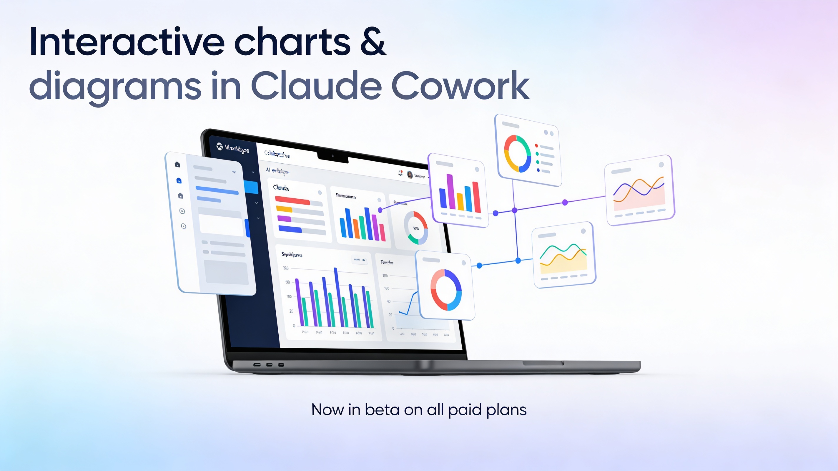
Interactive charts and diagrams are now live in Claude Cowork – available in beta on all paid plans.
This unlocks a new way to work with Claude: instead of just reading walls of text, you can actually see your ideas, data, and systems as interactive visuals that update as the conversation evolves.
What this new feature actually does
Claude can now generate custom charts, diagrams, and visualizations directly inside your chat, inline with the rest of the conversation.
No side panels, no separate files, and no manual chart-building in Sheets or slide decks just to “see” what’s going on.
When a visual explanation would help, Claude can:
Turn structured or messy data into interactive charts (bar, line, stacked bar, scatter plots, etc.).
Draw diagrams and flows – funnels, system diagrams, process maps, decision trees.
Build explainer visuals for complex concepts, from periodic tables to architecture diagrams.
These visuals are interactive: you can hover, click, and expand them, and they update or change as you keep talking to Claude.
How it’s different from Artifacts
If you already use Claude Cowork, you’ve probably seen Artifacts – the persistent documents, dashboards, and tools that live in the side panel.
Interactive charts and diagrams are a different layer on top of that:
Artifacts = more polished, persistent work you might share, download, or ship.
Interactive visuals = temporary, inline explanations built to help you understand something in the moment.
They’re ephemeral: as the conversation evolves, Claude can tweak, rebuild, or completely replace a visual to match your latest question.
Real-world ways to use it
Here are some practical workflows where this becomes a real multiplier, especially inside Claude Cowork spaces for teams:
Make sense of messy metrics
Paste a CSV or a table of metrics (signups, revenue, retention, etc.).
Ask: “Turn this into a clean trend chart and highlight key shifts by month.”
Then iterate: “Add a second chart comparing paid vs organic,” or “Color-code months where churn spiked.”
Design funnels and workflows visually
Provide high-level steps from a marketing, sales, or onboarding flow.
Ask: “Draw this as a funnel diagram with conversion rates and drop-off at each stage.”
Refine with prompts like: “Show me a version optimized for self-serve users only.”
Clarify complex systems and architecture
Drop in notes about your product architecture, data flow, or team processes.
Ask Claude to “Draw a system diagram that shows how data moves through these services, including external integrations.”
Then ask it to “Generate a second view that’s simplified for non-technical stakeholders.”
Learn faster with visual explainers
Studying something like the periodic table, a law-making process, or compounding interest?
Ask: “Visualize this concept as an interactive diagram,” or “Build a chart that shows how this changes over time.”
Use follow-ups to zoom in on specific parts of the visual.
Plan and communicate strategy
Turn quarterly goals, content calendars, or product roadmaps into timelines, swimlanes, or matrices.
For example: “Visualize this content plan as a calendar grouped by channel and theme,” or “Show this roadmap as a timeline with dependencies.”
How to prompt Claude for visuals
You can either let Claude decide when a visual would help or ask explicitly.
Prompt patterns that work well:
“Draw this as a diagram.”
“Turn this table into a chart.”
“Visualize how this metric changes over time.”
“Show this workflow as a step-by-step flowchart.”
“Turn these meeting notes into a process diagram with owners and handoffs.”
Once Claude creates a visual, you can iterate naturally:
“Make this simpler,” “Add labels for stakeholders,” “Split this into two views for marketing and product,” or “Highlight the biggest bottlenecks in red.”
Availability and where this lives
Interactive charts and diagrams are available in beta across all paid Claude Cowork plans.
The feature is on by default, so if you’re already using Cowork, you don’t need to flip any switches – just start asking for visuals in your spaces.
You can use it in:
Individual Cowork spaces where you collaborate with Claude on a single project.
Team or org-wide spaces to align around the same data and diagrams in real time.
Suggested call to action (you can tweak)
If you’re already using Claude Cowork, open a space you care about today and try this prompt:
“Here are last quarter’s metrics. Turn them into 2–3 interactive charts that tell the story, then suggest the single most important slide I should show my team.”
If you aren’t yet, this is one of the best times to experiment—especially if you’re a visual thinker, work with data, or lead teams that need to go from “numbers and notes” to “shared understanding” much faster.
claude codelive artifactsAIclaude cowork
Comments
Subscribe to join the conversation...
Be the first to comment